Color Magic: Add Joy + Depth with Complementary Colors
Do you ever feel overwhelmed trying to pick the right colors for your artwork?
You’re not alone! It can be frustrating when colors don’t quite work together, leaving your art feeling flat. But here’s the good news: you don’t need to overthink it! In this blog post, I simplify color theory to make it intuitive + fun, helping you choose colors that naturally complement each other + bring your artwork to life.
Imagine creating art that feels vibrant, balanced + alive—without second-guessing your choices. Complementary colors bring joy + depth to your practice, transforming your pieces into dynamic, expressive works full of life.
Let’s dive into the magic of complementary colors!
What Are Complementary Colors?
Simply put, complementary colors are pairs of colors that sit directly opposite each other on the color wheel. The easiest way to think about these colors is that “opposites attract.” When placed side by side, they create a striking contrast, making both colors appear more vibrant + bold.
Classic complementary color pairs include:
Blue + Orange
Red + Green
Yellow + Purple
These pairs work well together because of the strong contrast they create. Complementary colors naturally add energy, vibrancy + balance to your artwork, creating depth + making your pieces feel more dynamic.
Thinking Beyond the Basics: Unexpected + Vibrant Complementary Color Pairs
It’s easy to get stuck using the classic primary complementary colors, but thinking beyond these combinations can open up a new world of possibilities. Pairing colors like lavender + mustard or coral + teal gives your artwork a fresh, modern twist that still maintains balance + harmony.
Lavender + Mustard
Coral + Teal
Sky Blue + Rust
Pink + Emerald
These unexpected pairings create unique vibrancy, making your art feel both bold + balanced. By exploring these combinations, you can bring a new sense of joy + richness to your pieces.
Looking to dive deeper into color harmony?
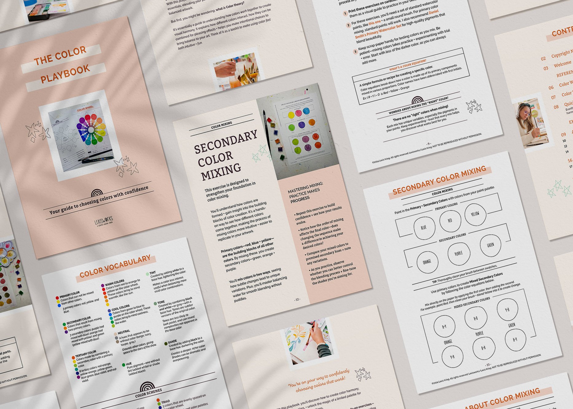
Check out The Color Playbook—a fun, approachable guide to help you make confident, intuitive color choices that bring joy + balance to your artwork.
Simplifying Color Theory for Creative Joy
When it comes to creating art, most people just want their colors to look good together—without the stress of overthinking the science behind it. Complementary colors, which are pairs of hues opposite each other on the color wheel, create a bold contrast that brings energy + balance to your work.
My approach to color theory makes it feel approachable + relatable, transforming an intimidating concept into a joyful part of the creative experience. Whether using classic pairings or unexpected combinations, complementary colors add depth, joy + vibrancy to your art—helping you create with ease.
To continue deepening your understanding of complementary colors + how to use them in your creative practice, check out Part 2 of this series, Color Magic: How to Use Complementary Colors in Your Art, where I share practical tips + fun exercises to bring even more vibrancy + energy to your artwork!
Want more creative inspiration? Sign up for The Art of Joy, my newsletter filled with tips, exercises, + playful ways to connect with your Creative Self + get my free supply list to kickstart your creativity!
Ready to Dive In?
Try my DIY Watercolor + Doodle Kit: A Playful Art Experience, complete with coordinating colors that take the fear out of choosing palettes. The kit includes orange + blue, paired with yellow, plum, and teal—colors that just work. These complementary + harmonious hues naturally balance each other, adding depth + vibrancy to your artwork.
Whether you're exploring bold contrasts or softer blends, this kit makes experimenting with color simple + joyful, so you can dive into creative play without the overwhelm!
If you're here because you're looking for creative guidance + ways to unlock your artistic potential, let me introduce myself...
Hi, I’m Lexis—the Denver-based artist, mama, + color enthusiast behind Lexisworks.


